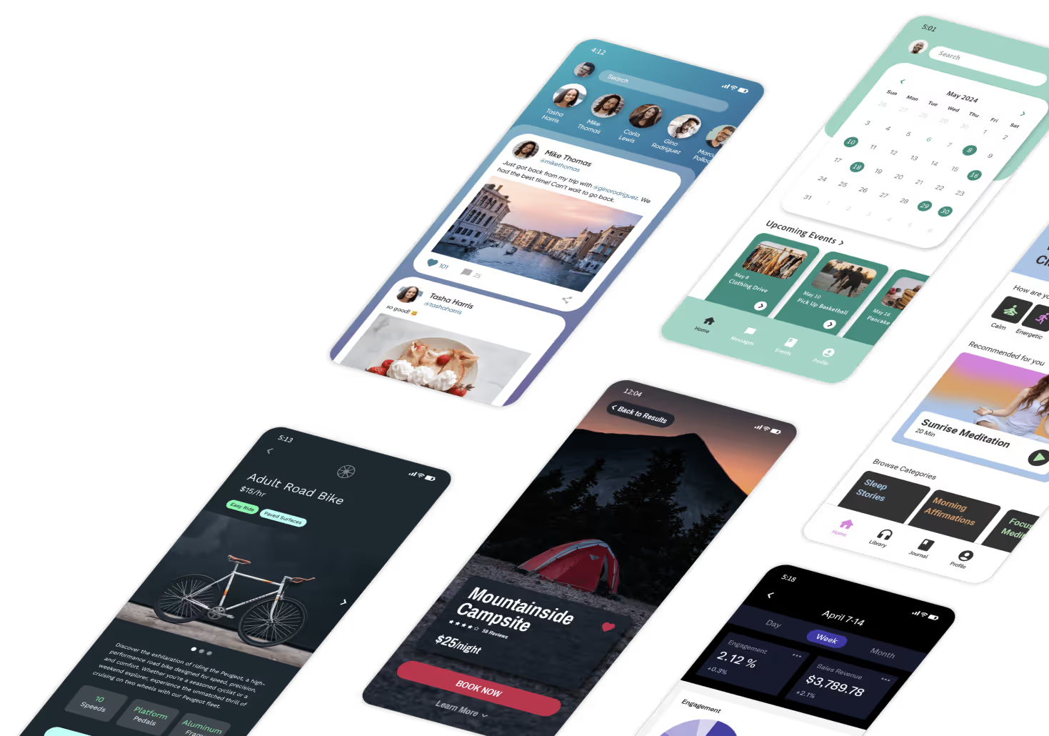
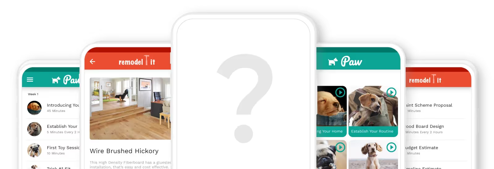
An awesome app always starts with an awesome idea, but not all awesome ideas turn into awesome apps. What comes after the idea? The process of bringing that great idea to life often involves a bunch of things that you didn’t consider – UI/UX research, marketing, development, hiring people, prototyping, wireframes… there’s more to it than meets the eye!

The thinking, planning, and execution that goes into planning your mobile app design is well worth the effort. It’s what sets your app apart from the millions of other apps on the market. Today we’ll explore wireframes and user journey planning.
It’s an essential part of your user experience, which is something we’ve discussed on our blog before. Let’s dive in!

What are Wireframes?
Like the floorplan of a building, a wireframe is a simple sketch that acts like a floorplan of a mobile app, explaining how different screens are connected to one another. Designers will often provide a complete wireframe diagram to a developer so they can build it out. It’s a great meeting point for developers and designers to work on the app idea together before the execution phase.
Wireframes generally include the following aspects of the user journey and experience:
- Possible app user actions
- Space distribution
- Positioning of elements
- App features
- Content hierarchy
- Transition between pages
Visualizing Your User Journey
Wireframes are one of the most commonly used ways to visualize your user journey, but there are other options too! We’ll cover the differences between the three main ways to help you visualize and refine your user journey, listed in order of the amount of detail in each: Wireframes, mockups, and prototypes.

Wireframes
This is usually the first stage of planning your user journey. We covered the basics of wireframes earlier on. The purpose is to clarify and communicate features and tie them together in a cohesive journey between screens. Wireframes do not incorporate the apps look and feel.
Mockups
A mockup is a version of a wireframe that is more detailed. It’s static, like a wireframe, but it contains more visual aspects like the branding colors, buttons, graphics, icons, and typography. Mockups help designers add in aspects of the user interface into the user journey.
Prototypes
Prototypes differ from wireframes and mockups for the main reason that they aren’t static. They include UI elements and animations, with buttons that are clickable. The idea of a prototype is to get the complete experience of using the app. It lets you test and discover any user journey issues before moving on to the development stage.
How Does Wireframing Improve the App Development Process?
It seems like a lot of work, sketching out the ideas, drawing up possible linkages between screens. So why is wireframing important? Let’s say you have a great app idea, maybe your local gym could benefit from a virtual training platform. You decide to build an app that includes training plans, a food diary, a calendar, and a community feed. But how do these features interact with each other? How do they provide a cohesive experience for people that attend the gym? An app wireframe helps bridge the gap between your initial idea and the final product that’s in someone’s hands.
1. Refine Your App Idea
When your app idea is just an idea, a lot flies under the radar. You may not see some glaring gaps in the execution or design. There may be some features that simply won’t make sense but you won’t know until it’s built out. An easier way is to wireframe your app idea so you can virtually interact with all the features and clarify your app idea.
2. Streamline Design and Dev Work
Wireframes are much easier to make than actually building out features on an app. You get to track and analyze the user experience and make the journey as easy and intuitive as possible before starting the process of design and development.
3. Helps You Focus on The End Users
Different people may engage with your app in different ways – and that’s a good thing. Doing simple persona-building helps you define the types of users you may have so that you can carve out specific user journeys for them. Wireframes help you visualize those journeys so that you can make them as seamless and effective as possible.
Steps to Visualize and Plan Your Mobile App User Journey

STEP 1: Sketch Out Your User Flow
Think of the different journeys your user may take if they’re given your app – how they’ll behave, what they’ll be drawn to, when they might leave. User flow is a chart that draws out the specific steps a user can take to complete a task. This chart will help you figure out how many screens you need to complete each task and interact with features.
This diagram typically just has rectangle frames and arrows connecting them. It doesn’t necessarily have to be linear, since users can take different paths to complete the same task. The objective is to provide clarity as you move to the following steps.

STEP 2: Design Your App Screen
Now it’s time to roughly piece together what the app screen may look like. This will give your user flow some structure and will be one step closer to a mockup. You can sketch out where particular elements, buttons, and graphics will be.
Generally, boxes are used to represent content in a clear visual hierarchy. These boxes represent how you want your user to process the information on each screen, and their sizes are sketched out accordingly.
This means the important information is placed in bigger boxes from the top to bottom, and left to right in order of priority.
STEP 3: Add Your Copy
No more dummy text! Goodbye, ‘Lorem Ipsum’! Now it’s time to add the actual copy to your screen sketches. It may seem a bit early to do this, but as you start adding copy, you may realize that some UI elements don’t fit the way you thought. Or it might make more sense to rework some parts of the user flow entirely. If you need a simple guide to writing copy for your mobile app, check out this guide.
STEP 4: Link Up Your Screens
Now comes the fun part. Up until now, you’ve only sketched out individual app screens, and now it’s time to connect the screens. This helps your dev team understand how the app will function and how it’s to be built out. To make it easier, assign a reference number to each app screen so you can collaborate with other teams to work on the design and development.
STEP 5: Build Your Prototype
Now it’s time to transform your wireframe into a working prototype. This involves adding more details to your wireframe to end with a version that looks and feels like the final version of your app.
A clickable prototype is an even better option because it gives you a more comprehensive insight into what the final user experience will be like.

Our Top Tools To Visualize Your Mobile App User Journey
User journey planning and wireframing may feel like an intimidating process, especially if you’re new to building an app. But don’t worry! There are some awesome, powerful tools that make the process much, much easier. A good wireframing tool should ideally have templates, make collaboration easy, and have smooth vector editing. Here are a few great options to consider.
Sketch
Sketch is a popular wireframing tool, available on Mac only. According to their website, “Sketch gives you all the tools you need for a truly collaborative design process. From early ideas to pixel-perfect artwork, playable prototypes and developer handoff.” Key features of Sketch include vector editing, pixel-perfect precision, ability to sync with hundreds of plugins, ability to export presets and code, prototyping, and tools for collaboration.
AdobeXD
AdobeXD is one of the most widely-used tools for wireframing and prototyping. Adobe calls it the “fastest and most reliable UX design solution on the market for companies of 10 or 10,000. Break through bottlenecks, iterate rapidly, and scale for the future.” It’s made for design and backed by a solid infrastructure. You can design with reusable elements (and edit), responsively resize groups and objects, and create universal assets, styles, or a repeat grid.
Zeplin
Zeplin is a collaboration and handoff solution, which enables enterprises to share ideas, organize projects and create products using a digital workspace. The platform assists users with generating global style guides, enabling designers and developers to organize, update and share design system colors, text styles, codes, and other components in a centralized repository with drag-and-drop capabilities. It integrates well with software like Adobe XD and Sketch.
Figma
Figma is an online, cloud-based, collaborative, vector design tool. On your browser, you can create your wireframe and prototype it in one place. Because of its real-time collaboration capabilities, Figma makes it possible for multiple designers and stakeholders to work on the same project at the same time.

Let’s Wrap It Up
While wireframing may sound tedious and painstaking, it’s well worth the effort. Good user journey planning helps you understand your app’s purpose and its target users better. And while it may not seem that way, it also optimizes the amount of time and money you spend on design and development because it minimizes the likelihood of wasted effort.
Happy building!


